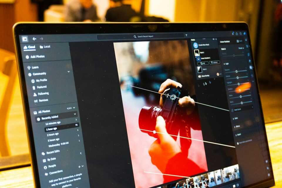
If you’ve ever lost hours chasing inconsistent color, soft details, or messy exports, a clear image processing workflow is the difference between guesswork and reliable results. This guide lays out a practical, end-to-end image processing workflow that you can copy, adapt, and scale—from the moment files arrive on your drive to the moment they land in print or on the web. The goal is not to lock you into a single tool, but to help you build a structured path that works with Lightroom, Capture One, Darktable, Affinity, Photoshop, or any modern editor. Along the way you’ll find checklists, pitfalls to avoid, and examples. For additional resources, explore the articles on ePhoto Life.
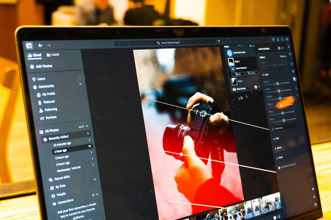
Building an image processing workflow step by step
Before diving into individual techniques, let’s define what a repeatable sequence looks like. A workflow is not just a list of sliders; it’s the sequence of decisions and the order in which they’re made. There are three phases: intake (ingest, organize, set color context), development (global corrections and creative grading), and output (retouching, resizing, sharpening, and export logic). If you mix these up—say, sharpening before noise management—you risk compounding artifacts. Likewise, exporting without embedding the right profile can make a calibrated monitor’s result look washed out on the client’s device. The sections below outline each phase in depth so you can refine yours, whether you’re editing a single hero image or a thousand-event photos.
Why a repeatable image processing workflow matters
Consistency beats heroics. Professionals value a repeatable system because it delivers predictable results under pressure. When your sequence is stable, you spend less time re-fixing the same problems and more time making images look the way you imagined. Consistency also simplifies collaboration: a second editor can pick up your project and understand where decisions were made. Finally, a stable workflow makes troubleshooting easier. If you changed nothing about intake but altered color grading, and something broke, you know where to look. Your workflow becomes an observable, testable process, not a foggy memory of what might have happened on a late night.
- Consistency: fewer surprises across sessions and devices.
- Speed: batch steps where possible; reserve manual time for true creative choices.
- Quality control: clear checkpoints reduce rework and client revisions.
Think of the workflow as a chain; each link must be strong. If one link is weak—say, unmanaged color—it compromises every downstream decision, even if the creative choices are excellent. By codifying your steps, you protect the whole chain.
From capture to delivery: the big picture
Great outcomes start before import. Capture choices shape everything: shooting RAW, exposing to protect highlights, using a consistent white balance reference (like a gray card), and avoiding excessive in-camera picture styles that may bias your judgment later. Once the files land on your machine, the first questions are organizational: where do they live, what’s their naming pattern, and how will you back them up? After that, color management and monitoring set the context in which edits make sense. Only then do we move to global corrections and creative choices, followed by local retouching and final export. The end of the pipeline is mostly logistics: format, size, output sharpening, metadata, delivery method, and archiving.
Here’s the high-level flow many working editors use:
- Intake: copy, verify, rename, add metadata, back up.
- Context: set color management, calibrate display, apply lens corrections.
- Develop: exposure and tone, white balance, noise management, capture sharpening.
- Grade: color grading for style consistency (per project, per client).
- Retouch: local fixes, distractions removal, skin or product polish.
- Output: resize, export format variants, embedding profiles, delivery.
- QA: on-device checks, consistency review, archive and versioning.
Setting up a non-destructive environment
Non-destructive editing preserves options and reduces the cost of change. In RAW editors, this is the default: adjustments are sidecar instructions applied on the fly. In pixel editors, non-destructive means duplicate layers, adjustment layers, masks, and smart objects rather than direct pixel changes. For batch work, non-destructive also means preset-driven consistency. Build presets for intake metadata, base tone curves, and film simulations (or their digital equivalents). Avoid baking effects into exported intermediates unless you’re sure they won’t need to be reversed.
Practical setup tips:
- Create a project template folder with subfolders for RAW, Developed, Exports, and Delivery.
- Use a Catalog or Session model depending on your tool: catalogs for ongoing libraries, sessions for client jobs.
- Enable auto write of XMP/sidecars so adjustments travel with files if software changes.
- In pixel editors, favor adjustment layers and masks. Use smart objects for filters, so you can re-enter and tweak.
- Document your defaults. A simple text file noting base profile, tone curve, and preferred noise model prevents drift.
Non-destructive thinking also applies to creative grading. Instead of a single heavy LUT or filter, consider separate layers for contrast curves, color balance, and split toning. That way, you can later dial each one independently to match a specific client brief.
File intake, naming, and metadata
The most glamorous edits are useless if your files are hard to find. Intake begins with copying and verifying your camera cards to two locations: the working drive and a backup. Then comes renaming and metadata. A predictable pattern such as YYYYMMDD-Client-Project-Sequence ensures lexicographic sorting and humans can read it without a database. Add metadata templates with creator, copyright, client, and usage terms. If you shoot multiple cameras, sync capture times so ordering is meaningful across bodies. If you hand files off to another editor, consistent naming prevents accidental overwrites and makes round-tripping safe.
Checklist for reliable intake:
- Use a verified copy app to reduce card read errors.
- Apply a renaming template that avoids spaces and special characters.
- Add metadata templates at import: author, copyright, contact, client, job keywords.
- Enable automatic lens profiles and default chromatic aberration fixes.
- Back up to an external drive or NAS before formatting cards.
Finally, tag hero candidates, rejects, and review status. When the creative phase begins, you’ll focus on the right frames, not the whole dump.
Color management: profiles and monitoring
Good color is not an accident; it’s the context of every judgement. Calibrate and profile your display with a hardware colorimeter. Use a consistent white point (often D65) and gamma (2.2 or sRGB curve) that matches your delivery. Choose a working color space that balances gamut and practicality: ProPhoto RGB for maximal editing headroom in RAW editors, or Adobe RGB for a middle ground, and sRGB for web-bound outputs. The key is to know when conversions happen and avoid double transforms. If your software applies a display transform, make sure it aligns with your calibration.
Common pitfalls and fixes:
- Mismatch between working and export spaces: Keep working in a wide space, but export to the client’s target; embed the profile so downstream devices know what to do.
- Uncalibrated displays: Colors drift over time; schedule monthly calibrations.
- Ambient glare: Control viewing environment; even a great display looks inconsistent in uncontrolled light.
Set a reference image wall—five to ten varied photos that you trust. Revisit them during grading to reset your eyes. When a project drifts stylistically, that wall reminds you what “neutral” looks like in your environment.
Exposure and tonal correction
Development starts with establishing a clean baseline. Fix exposure globally before micro-contrast. Use histograms, zebras, and clipping warnings; aim for full tonal use without crushing shadows or burning highlights (unless it’s a creative decision). Set white balance using a neutral reference if available. Apply a base tone curve that flattens camera contrast slightly so you preserve headroom for creative contrast later. Use the primary exposure, blacks, whites, shadows, and highlights controls to align the tonal map. Then balance midtones with a subtle S-curve, minding skin tones or specific product colors.
When the base looks clean, check for lens issues and enable corrections for vignetting, distortion, and chromatic aberration. It’s easier to judge edges and tones when geometry is corrected. Only after global tonal balance feels right should you start adding clarity, texture, or dehaze; these are powerful but easy to overdo and can magnify noise or halos if applied too early.
Noise management and fine detail
Noise management and detail enhancement are two sides of the same coin. Tackle noise before sharpening so you don’t amplify grain. Modern tools provide profile-based denoising that estimates sensor noise patterns. Start with luminance noise to smooth grain in midtones and shadows, then refine color noise (chrominance) to combat speckled hues. Don’t chase perfectly “clean” images; a bit of texture preserves a natural look, especially in high-ISO documentary work.
Sharpening comes in layers: capture sharpening (compensate for sensor/AA filter softness), creative sharpening (emphasize subject features), and output sharpening (match export size and medium). Use radius and threshold carefully: a larger radius adds general crispness; a higher threshold prevents micro-noise from being sharpened. If the subject is faces, prefer texture and clarity controls at low amounts in skin-friendly ranges while masking edges so backgrounds don’t turn crunchy.
Practical sequence:
- Profile-based denoising first (start conservative).
- Capture sharpening tuned to lens and resolution.
- Creative sharpening localized with masks or brushes.
- Output sharpening last, tailored to print or screen.
Color grading and style recipes
Color grading harmonizes a set and communicates mood. Build grade in layers so it’s easy to tweak: start with white balance and tint, move to HSL (or color mixer) for channel-specific nudges, then use a color grading panel (shadows, midtones, highlights) or split toning to add mood. Consider using LUTs as a starting point, but keep control with adjustment layers or grouped controls so small changes don’t throw the whole image off. Your goal is consistency across a set, not a one-off trick. Save style recipes per client or project, including notes about intended outputs (e.g., sRGB web portfolio, CMYK print).
When building a grade:
- Protect skin tones by keeping hue ranges intact, especially in commercial or portrait work.
- Use selective color or channel mixer to steer tricky hues (e.g., foliage, sky) without global shifts.
- Use curves to control contrast per channel if you want subtle cross-processed looks.
- Reference your grade against the project’s reference wall to prevent drift.
Finally, evaluate in different previews: a neutral gray UI background, a dark UI, and an exported JPEG viewed outside the editor. If the grade holds up in all contexts, it is robust.
Retouching and local adjustments
Local work turns a good base into a polished image. Keep the edits natural and purposeful. Use dodge and burn to guide attention; cloning or healing to remove distractions; frequency separation or careful texture work for skin; and perspective/warp tools to correct lines in architecture or product frames. Always keep a record of local changes—whether that’s layers, masks with names, or adjustment log notes—so another editor can understand what happened without reverse engineering.
Local tools and habits that scale:
- Label layers and groups by function (e.g., “Skin base,” “Eyes +1,” “BG cleanup”).
- Prefer masks to erasers; prefer blending modes to extreme opacity adjustments.
- Zoom out often; retouching that looks fine at 200% can look artificial at 25%.
- When in doubt, reduce opacity by 10–20% to keep a natural look.
Keep a short list of common defects for your niche: dust spots on sensors, flyaway hair, glare on glass, or fingerprints on products. Add them to your QA checklist so they’re never overlooked.
Export pipelines: sizes, formats, and delivery
Exports are decisions turned into files: what size, format, profile, metadata, and sharpening are appropriate for each destination. Build a small set of repeatable export presets and map them to their uses. For the web, sRGB JPEGs with balanced compression and long-edge resizing are common. For print, larger TIFFs or high-quality JPEGs with embedded profiles and minimal compression make sense. If the destination is a CMS, check its auto-resizing and compression behaviors to avoid double-compression. For social platforms, tailor dimensions to prevent unintended crops.
Baseline preset kit:
- Web standard: sRGB JPEG, 2048 px long edge, quality ~80–85, output sharpening for screen.
- Portfolio large: sRGB JPEG, 3000–4000 px long edge, quality ~85–90.
- Print master: Adobe RGB or ProPhoto TIFF, 16-bit if needed, no compression; print sharpening off unless specified.
- Client contact sheet: sRGB JPEG, 1280 px long edge, small watermark if required, metadata retained for searchability.
Delivery logistics matter too: ensure filenames remain human-friendly, include version numbers if applicable, and retain IPTC metadata unless the client requires stripping it for privacy. Test a sample in the final environment—browser, app, or printer—before shipping the full set.
Automation and batch processing
Automation frees your attention for creative choices. Use batch presets for recurring tasks: intake metadata, base tone curves, export sizes, and output sharpening. Build project-specific presets for grades and apply them to sets, then refine outliers. Scripts or actions can cascade steps in pixel editors (e.g., building proof sheets or creating multi-size exports). Watch folders and publish services can push finished files to portfolio sites or cloud storage without manual drag-and-drop. Automation does not equal laziness; it ensures consistency and reduces fatigue-driven mistakes.
Helpful automations:
- Auto-apply lens corrections and base noise models at import.
- Auto-tag camera and lens metadata for faster filtering.
- Use smart collections to find missing keywords, unpublished photos, or files pending export.
- Set up export queues by destination and trigger them at the end of each work block.
As you automate, document what each preset does. Give them clear names and version numbers. When a preset evolves, keep the previous version for a while in case a client expects the older look.
Quality assurance and version control
QA is the backbone of trust. Build a short, repeatable checklist and run it before every delivery. Verify color intent by viewing exports on a second, calibrated display and a non-calibrated consumer device. Scan for halos, banding, dust spots, cloned patterns, and awkward crops. Compare multiple images from the same set to ensure the grade and contrast match. Embed metadata and confirm it survived export. Finally, maintain version control: use suffixes like _v1, _v2 or add a simple change log so you can roll back. If an editor or client requests changes, you’ll know exactly where to branch.
QA checklist starter:
- Exposure and contrast consistent across the set.
- Skin tones/natural colors within expected ranges.
- No visible artifacts from noise management or sharpening.
- Exports match requested dimensions and formats; profiles are embedded.
- File names and metadata conform to the agreed spec.
Quality control saves you on revisions and strengthens client confidence because you catch issues before they do.
Performance tuning: hardware and storage
Editing feels better when your system keeps up. A balanced machine outruns a single “fast” part. For RAW-heavy workflows, prioritize ample RAM and fast storage. A modern GPU accelerates demosaicing, denoising, and certain pixel operations in many editors. Use NVMe SSDs for working catalogs and caches; store archives on larger SATA SSDs or HDDs. Keep a scratch disk with lots of free space; many apps slow down when cache directories fill. Calibrate a reliable monitor and consider a second display for panels or reference images. Finally, invest in a robust backup scheme: 3-2-1 (three copies, two different media, one off-site) is a simple mantra that reduces panic when drives fail.
Daily habits also improve performance: clear caches periodically, keep drivers updated, and avoid running multiple heavy apps simultaneously. If you edit on a laptop, ensure it’s on mains power during heavy exports to avoid thermal throttling. These habits translate into smoother sessions and fewer stalls during deadlines.
Common mistakes and how to fix them
Even experienced editors hit snags. Here are recurring issues and practical fixes:
- Editing out of order: Doing creative grading before baseline exposure leads to inconsistent results. Fix: standardize your order; make exposure and white balance first.
- Over-sharpening: Halos around edges and crispy skin. Fix: reduce radius/amount; sharpen selectively with masks; add output sharpening at export instead of excessive capture sharpening.
- Noise and detail fighting each other: Aggressive denoise plus aggressive clarity equals plastic surfaces. Fix: aim for balance; allow gentle texture to remain.
- Color mismatches across a set: Grading per image without a reference wall leads to drift. Fix: create a style recipe; apply to the set; refine exceptions.
- Wrong export profile: Images look dull on client devices. Fix: export in sRGB for general web use; embed the profile; test on an external viewer.
Most problems trace back to a missing checkpoint. Insert a short QA stop after global development and again after export. Small pauses prevent long rework later.
Case studies: three project templates
Different genres emphasize different steps. Use these templates as starting points and adjust for your tools.
Portrait session
- Intake and cull to a tight selection.
- Baseline exposure and white balance per lighting setup.
- Noise management tailored to ISO; capture sharpening modest.
- Skin-friendly grade: protect orange/red hues; add gentle midtone contrast.
- Retouch: distractions, flyaway hair, gentle dodge and burn.
- Export: sRGB JPEG for client proofing, high-res for print.
Landscape set
- Apply lens corrections and geometry early.
- Balance dynamic range with highlights/shadows; watch for halos.
- Grade: subtle split toning; control blues and greens; keep sky believable.
- Local: graduated filters, subject masking for selective contrast.
- Export: web and print variants; test on multiple displays due to wide tonal ranges.
Product series
- Strict intake naming; identical framing and focal length markers.
- Neutral white balance; color-accurate grade; match across the lineup.
- Retouch: dust, reflections, perspective corrections.
- Export: multiple background variants; DPI and profile per vendor spec.
Each template compresses the same overall pipeline, emphasizing the decisions that matter most for that subject. With practice, you’ll evolve your own genre-specific recipes that still fit neatly into the broader framework.
Bringing it all together
The hallmark of a mature workflow is calm control. Intake is predictable, color reliable, development orderly, grading intentional, retouching restrained, and exports consistent. Your tools may change over time, but the logic will travel. Start by formalizing what you already do—write down your order, name your presets, create your QA list. Then refine one bottleneck at a time: perhaps color management this week, export presets next, automation after. Within a few projects, you’ll feel the compound effect: faster turns, fewer surprises, and a look that stays true from capture to delivery.
A structured approach doesn’t box you in; it gives you the freedom to experiment without losing the thread. When you return to a project after a week—or a year—you’ll know exactly where you left off and how to pick up the story again.