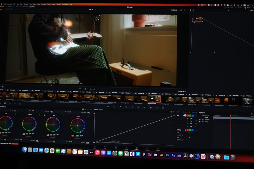
Lightroom color grading is the craft of steering tone and color with intention so your images communicate a consistent mood without sacrificing natural detail. This camera-to-export guide gives you a practical workflow you can repeat on any shoot, with enough flexibility to adapt to portraits, landscapes, products, interiors and more.
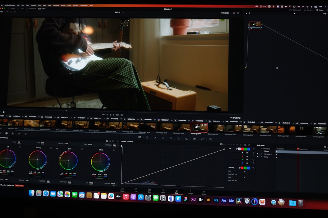
Lightroom color grading: build your baseline the right way
Strong color work begins before you touch any color wheel. Your baseline is a short sequence of decisions that stabilizes the file and makes later creative moves predictable. Use the following order on every image so you spend less time rescuing and more time shaping mood:
- Profile first: Pick a camera profile that fits your intent (Adobe Color for general use, Camera Matching profiles to mimic in‑camera looks, or a third‑party filmic profile for softer roll‑offs). Profiles change how RAW data is interpreted, so set this before anything else.
- Normalize exposure and white balance: Establish a believable midtone exposure, then set a white balance that matches the story you want to tell. Neutral is a checkpoint, not a destination.
- Set a gentle tone envelope: Use Whites and Blacks to create headroom. Aim for a calm S‑curve rather than maximum punch this early.
- Work non‑destructively: Keep your edits modular. Avoid baking in heavy looks with import presets or early global saturation spikes.
A clean baseline means each later slider does less heavy lifting. You see cause and effect clearly, and styles sync more consistently across a series.
Catalog hygiene, import decisions and color management
A stable color pipeline starts with boring but critical habits. Small setup choices save hours later and help avoid surprises when you deliver images to web or print.
- Import presets kept minimal: Create a camera‑specific import preset that applies lens corrections, profile choice, and modest noise reduction. Resist the urge to bake a look at import.
- Monitor discipline: Work on a calibrated display, dim obvious color casts in your workspace, and use a neutral desktop background. These changes reduce bias while you judge subtle hues.
- Know Lightroom’s color space: The Develop module runs a wide‑gamut internal space. Saturations that look fine in Develop may clip when you export to smaller gamuts. This awareness helps you pick export settings later.
- Version control and virtual copies: When exploring bold looks, create a virtual copy before big moves. You’ll be able to compare calmly and roll back without friction.
For ongoing learning and reference, bookmark the Photo Editing Tutorials hub at ephoto-life.com/photo-editing-tutorials. Building your own small library of baselines and preset notes pays dividends on deadline days.
Exposure, white balance and the histogram
Color sits on top of believable exposure. Get these fundamentals in place before you chase a creative palette:
- White balance with intent: Start with a neutral pick from an eyedropper or camera reference, then steer slightly warmer or cooler to suit the scene. A winter ridge can carry a cool tone without drifting cyan; a wood‑lit cafe can lean warm without turning orange.
- Control midtone exposure: Adjust Exposure for clarity of the subject. Your histogram is a guide, but the subject decides the destination. Use highlight and shadow clipping warnings as guardrails rather than hard rules.
- Anchor black and white points: Use the Whites and Blacks sliders to create enough headroom. You want space for the curve and grading wheels to add character later.
- Protect bright color: If important detail lives in highlights (backlit skin, chrome, water), pull Highlights down gently to keep hue information intact for later grading.
Think of this step as seasoning the scene to taste, not final plating. You’re simply making sure the ingredients are fresh and balanced.
Tone curve and global contrast that support color
The tone curve and presence controls shape the stage on which color performs. Small changes here can make color feel denser, cleaner, or muddier—often more than saturation alone.
- Start with the parametric curve: A subtle S‑curve adds separation without harsh edges. Avoid deep black crush unless it serves a style choice you’ll keep consistent across the set.
- Use the point curve surgically: When you know exactly what you want—lifting near‑blacks while keeping true black anchored, for example—switch to the point curve for precise anchor points.
- Presence controls as spices: Texture adds micro‑detail; Clarity shapes midtone contrast; Dehaze changes global separation. Small amounts go far, and they interact with color. Excess Clarity or Dehaze can make skin look brittle or emphasize noise in flat skies.
- Mind highlight roll‑off: A gentle shoulder in the curve preserves highlight hue. If whites blow early, your warm highlights later may look chalky instead of luminous.
When the canvas is even and flexible, your color decisions will feel effortless rather than corrective.
The HSL/Color Mixer as a precision tool
HSL (Hue, Saturation, Luminance) is the precision screwdriver of Lightroom. Used in small, coordinated moves, it separates similar hues, sets emphasis, and controls visual weight without breaking realism.
- Hue for separation: If foliage and yellow signage merge, nudge Green Hue slightly toward cyan and Yellow Hue toward orange so each reads clearly. Moves of 2–6 points are often enough.
- Saturation for emphasis: Add a touch where you want the eye to land, subtract where calm is helpful. Don’t chase saturation for its own sake; combine it with luminance to keep colors feeling alive.
- Luminance for shape: Lowering Blue Luminance deepens a midday sky and adds structure. Lifting Orange Luminance adds glow to skin and reduces the need to brighten the entire frame.
- Use the target tool: The on‑image adjustment tool ties HSL sliders to real pixels. Drag up or down on the area whose color you want to change to discover which channels are involved.
Train yourself to think in chords: hue, saturation and luminance work like notes that should harmonize rather than compete.
Color Grading wheels: shadows, midtones and highlights
The Color Grading panel (three wheels plus a global wheel) is where mood crystallizes. A structured approach keeps the look coherent and repeatable.
- Pick an anchor wheel: Decide which tonal range carries the emotional bias. A classic cinematic setup uses cool shadows, near‑neutral midtones, and slightly warm highlights. A nostalgic daylight look often lets midtones lean warm while shadows stay honest.
- Blend and balance: The Blending control decides how much the three ranges overlap; Balance shifts which range dominates. If your image looks split into bands, increase Blending. If one range feels overpowering, adjust Balance slightly instead of chasing each wheel.
- Stay subtle: Your eye is sensitive to bias. Start with very low wheel saturation and sneak up on the feeling. If the image starts to look monochrome, you’ve gone too far.
- Use the global wheel last: Once the three ranges feel right, the global wheel can add a whisper of unity—a faint warm or cool cast that ties the look together.
As you work, toggle the panel on and off to confirm you’re adding emotion rather than a tinted veil.
Masking for targeted color control
Modern Lightroom masking turns complex selections into routine edits. The goal isn’t to cut out objects perfectly; it’s to tell the software which regions should ignore your global biases and which should carry them.
- Color Range masks: Sample a color and narrow Range Smoothness so adjustments don’t spill. Calm neon signage without flattening the street, warm skin separately from a cool background, or harmonize mismatched wardrobe pieces.
- Luminance Range masks: Define zones by brightness, independent of hue. Let highlights keep a warm kiss while shadows lean cool, or shield the deepest shadows from saturation boosts that would reveal noise.
- Subject and Sky masks: Auto‑selections are great starting points. Invert them to protect the subject from aggressive background moves, or protect the sky from oversaturated blues when you push greens for a lush feel.
- Combine masks: Intersect a Subject mask with a Color Range mask when you need to fine‑tune skin only on a face, not hands or background elements.
Masking shines in series work: copy a mask structure, re‑target color range sliders on the next frame, and you’ll maintain consistency without repainting from scratch.
Camera profiles and calibration
Profiles and the Calibration panel are the levers under the hood. They change the “dye set” in your digital emulsion before other panels see the data. A few thoughtful nudges here can reduce the need for heavy HSL or grading moves later.
- Profile choice sets the attitude: Adobe Standard yields a neutral base; Adobe Color has more pop; Camera Matching profiles echo brand‑specific in‑camera looks; third‑party profiles can introduce gentle color separation and film‑like roll‑offs. Try a couple before you commit.
- Calibration primaries: Red, Green and Blue Primary hue/saturation sliders subtly shift how colors interact. For example, a small Red Primary Hue shift toward magenta can bring a peachy skin bias; a modest Blue Primary Saturation lift can deepen skies without hammering blue luminance in HSL.
- Sequence matters: Set profile, then calibration, then revisit HSL and Color Grading. If you change profile late, your carefully tuned HSL relationships will shuffle.
These are optional tools—reach for them when your normal approach can’t achieve the feeling cleanly, not as a first resort.
Creative looks you can adapt
Recipes are a great way to learn cause and effect. Use them as scaffolding, then simplify to fit your subject and client.
Cinematic teal and orange
Why it works: Complementary separation between skin‑dominant warm tones and cooler backgrounds guides the eye and adds energy without shouting.
- Baseline: neutral exposure, moderate contrast, skin‑friendly white balance.
- HSL: nudge Orange Hue slightly toward red for richer skin; pull back Yellow Saturation to keep foliage from looking neon.
- Grading: cool shadows toward teal with low saturation; add a subtle warm tint to highlights; keep midtones near neutral.
- Masks: protect faces with a Color Range or Subject mask so the background carries more of the cool bias.
Moody low‑key
Why it works: Denser shadows and cool bias create quiet intensity while warm highlights preserve a human anchor.
- Curve: soft S with slightly lifted blacks for a gentle floor.
- Grading: cool shadows, neutral midtones, softly warm highlights.
- HSL: reduce Blue Luminance to deepen skies and jackets; reduce overall Saturation a touch to keep noise tame.
- Masks: Luminance Range mask to tame speculars; keep highlight hue intact.
Pastel daylight
Why it works: Lower saturation and lifted luminance create an airy palette; a mild warm midtone bias keeps skin lively.
- HSL: reduce global Saturation a little; lift Orange Luminance; lower Blue Saturation for calmer skies.
- Grading: warm midtones gently; keep shadows and highlights close to neutral.
- Presence: small negative Clarity to soften edges where appropriate.
Black and white with tone bias
Why it works: Removing color emphasizes shape and tone; a tiny split bias adds atmosphere without drawing attention to itself.
- Convert to B&W: adjust the B&W mix to keep subject separation.
- Grading: cool shadows or warm highlights by a hair; keep saturation extremely low.
- Curve: adjust contrast to suit subject (portraits often prefer softer contrast than architecture).
Genre‑specific guidance: portraits, landscapes, products, interiors
Different subjects place different demands on color judgment. Here are decisions that consistently help in common genres.
Portraits
- Skin first: Set white balance by skin rather than background. Use HSL to refine oranges and reds; lift Orange Luminance slightly for glow.
- Avoid brittle microcontrast: Texture can be flattering in fabric and hair but harsh on skin. Add a subtle negative Clarity inside a Subject mask when needed.
- Background harmony: Use masks to cool or desaturate busy backgrounds so attention stays on the face. Watch lips and teeth—if masks spill, narrow the Color Range.
- Match across a set: Shoot a gray reference or pick a hero frame in each lighting scenario. Sync WB and baseline first; apply creative moves second.
Landscapes
- Protect hue in highlights: If clouds or snow are important, keep a gentle highlight shoulder and avoid aggressive global saturation in bright tones.
- Foliage realism: Greens drift quickly toward neon when Yellow Saturation remains high. Subdue Yellow Saturation, shift Green Hue slightly toward cyan, then lift Green Luminance to restore presence.
- Depth cues: Cool shadows and warmer sunlit planes add depth. Use Luminance Range masks to bias grades by brightness instead of painting.
- Blue hour and night: Blue Luminance and the shadow wheel do most of the mood work. Add sparing global saturation to keep noise unobtrusive.
Products and e‑commerce
- Color accuracy: Keep profiles conservative and avoid wild calibration shifts. Use a Color Range mask to standardize brand hues across frames.
- Clean backgrounds: Use masks to neutralize background casts. For white backgrounds, keep slight detail in whites to avoid a cut‑out look.
- Reflections and speculars: Preserve color in highlights; use a gentle curve shoulder and lower Highlight Saturation if necessary.
Interiors and real estate
- Mixed light is normal: Balance by subject priority. Let window light stay slightly cool, warm practicals a bit, and aim for harmony rather than strict neutrality.
- Correct local casts: Use Color Range masks on walls and ceilings to remove green or magenta casts from cheap bulbs without touching furniture.
- Keep whites clean: Avoid heavy global saturation. Use HSL to control specific problem hues in wood and paint.
Consistency at scale: syncing, presets and QA
Color grading adds the most value when it’s consistent across deliverables. Build a simple system so your look travels cleanly from frame to frame and job to job.
- Grade a hero frame: Pick one representative image per lighting scenario, craft the look, then sync to similar frames. Sync panels that carry look and intent; leave Exposure and WB unchecked if lighting shifts across the set.
- Adaptive presets: Save presets that include profile choice, tone curve, HSL and Color Grading settings. Exclude WB and exposure. Name presets by intent (e.g., “Warm documentary”, “Cool editorial”) rather than by location.
- QA in Survey and Compare views: Flip between frames rapidly to spot drift in skin hue or foliage saturation. Tweak HSL and mask strength, not global sliders, to harmonize.
- Micro‑checklist before export: Profile, exposure, WB, curve, HSL, grading, masks, presence, noise handling, sharpening, export intent. Two quick passes catch most inconsistencies.
QA and troubleshooting in practice
Even well‑planned edits misbehave. Here are common issues and pragmatic fixes you can apply quickly.
- Splotchy skin after global Presence changes: Back off Clarity or Dehaze globally. Add a soft Subject mask with gentle negative Clarity and Texture. Lift Orange Luminance a touch and reduce Red Saturation if needed.
- Banding in skies or studio gradients: Reduce extreme saturation moves; avoid pushing single channels too far. On export, keep JPEG quality high to reduce banding risk. Adding a subtle grain pattern can disguise minor banding.
- Radioactive greens and yellows: In HSL, lower Yellow Saturation and shift Green Hue slightly toward cyan. Raise Green Luminance to restore presence. Add a mild cool shadow bias in the grading wheel only after HSL is balanced.
- Monochrome cast after grading: You likely leaned too hard on one wheel. Reduce wheel saturation and revisit Balance. Add a small global wheel adjustment to glue the ranges rather than letting one dominate.
- Skies look plastic: Heavy negative Blue Luminance or excessive cool shadow bias will do that. Reset the Blue Luminance closer to neutral, rebuild with a Sky or Color Range mask, and deepen using the curve rather than saturation alone.
- Inconsistent color across a set: Recheck white balance first, then profile choice. Only after baseline alignment should you sync HSL and grading.
- Clipped reds at high saturation: Reduce Red Saturation, lift Red Luminance, and consider a small Red Primary saturation change in Calibration. If the subject allows it, lower global Vibrance instead of Saturation to keep extremes in check.
- Noise exaggerated by color moves: Saturation boosts amplify chroma noise. Use Color Noise Reduction modestly, and apply saturation more selectively with masks to keep clean areas clean.
Export, soft proofing and delivery
The last mile is where many great looks fall apart. A few deliberate habits keep your output predictable for both web and print.
- Soft proof for destinations: Create a proof copy and pick a destination color space if you have an ICC profile (especially for print labs). Make small saturation or luminance nudges to suit the target.
- Web export: sRGB color space, sensible output sharpening for screen, and a resolution that matches your platform. Keep JPEG quality high enough to avoid banding and blockiness in subtle gradients.
- Print export: If a lab profile is available, use it to simulate compression of colors. Slightly darker midtones often look better on paper. Preserve near‑white detail so paper texture has room to show.
- Keep export presets: Build a small library labeled by destination (Web‑sRGB‑Large, Web‑sRGB‑Small, Print‑Lab‑ICC) so you don’t second‑guess on deadline days.
Delivery is the first moment clients see your decisions outside Lightroom. Keeping this step routine helps ensure your intent survives the medium.
Comparisons that clarify choices
When two different tools can achieve a similar feel, side‑by‑side logic speeds decisions and keeps grade drift in check.
- Warmth via white balance vs. highlight wheel: White balance shifts the entire scene’s neutral point and affects skin baseline. Highlight warmth adds glow without moving midtones. If ceiling lights look sickly when you warm WB, prefer the highlight wheel.
- Cool shadows via curve vs. wheel: A curve changes density; a wheel changes hue and saturation. If you want mood without a visible cast, curve first. Add wheel bias only if you need a color story.
- Foliage richness via HSL vs. calibration: HSL is targeted and easier to sync across mixed cameras. Calibration tweaks how primaries interact and is best kept subtle—use it when HSL alone can’t hit the feeling cleanly.
- Vibrance vs. Saturation: Vibrance raises saturation in low‑sat areas more than in already saturated colors; it’s safer for skin. Saturation moves everything equally and should be used with restraint around skin and clashing wardrobe.
A compact, repeatable checklist
Tape this by your monitor until it’s muscle memory. Most mistakes disappear when you run this sequence calmly and consistently.
- Profile first (Adobe Color/Standard, Camera Matching, or filmic).
- Baseline tone (WB, exposure, whites/blacks) with highlight color intact.
- Curve (parametric S; point curve for special cases).
- HSL (hue separates, saturation emphasizes, luminance shapes).
- Color Grading (pick an anchor wheel; low saturation; blend/balance).
- Masks (color or luminance range; subject/sky; intersect when needed).
- Presence (Texture, Clarity, Dehaze in small doses; watch skin).
- Consistency (hero frame → sync → spot‑correct).
- QA (survey view, flip through for hue drift and saturation spikes).
- Export intent (soft proof; destination presets; sharpen appropriately).
Color grading rewards patience. Slow down for a few frames to learn cause and effect, then speed up with presets that reflect your taste. Over time your work will feel intentional, consistent and visually calm—even when the color story is bold. For more examples and breakdowns, visit the tutorials hub at ephoto-life.com/photo-editing-tutorials.