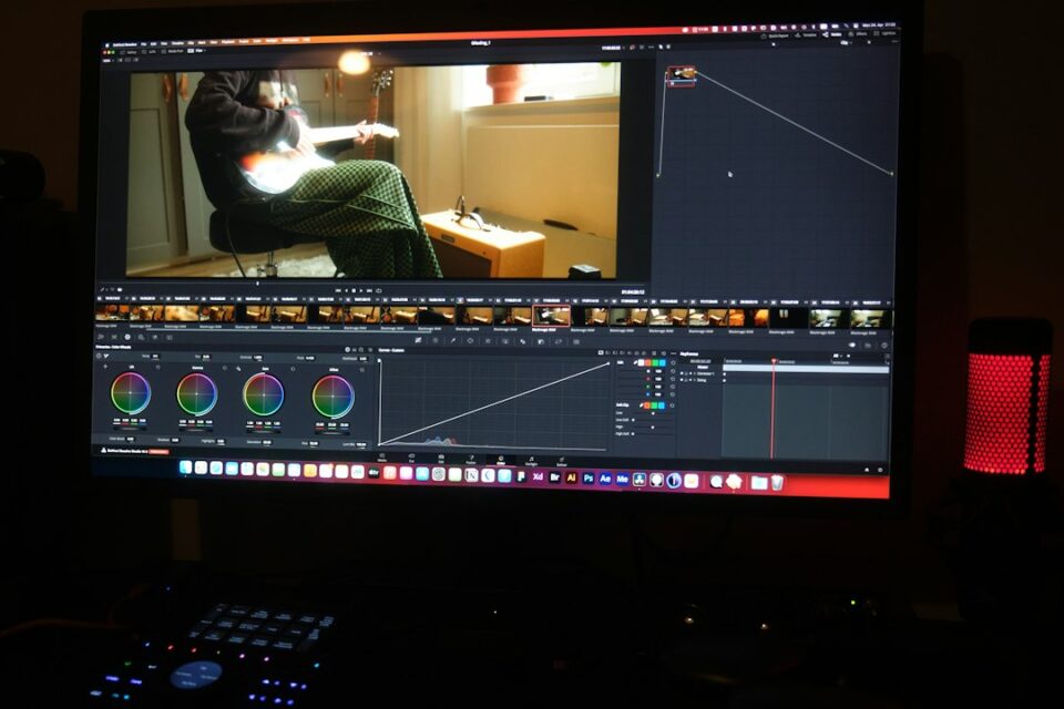
If your team exports the same project twice because the lower thirds feel off or the thumbnail font wandered again, you are overdue for a video editing style guide. A video editing style guide distills your brand, workflows, and technical standards into a document editors actually use. It pulls chaos into a repeatable system. In my studio, formalizing our rules cut review cycles in half and made every deliverable feel like it came from one voice, even when five editors touched the timeline.
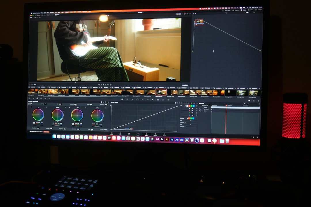
Build Your Video Editing Style Guide
Think of a style guide as the house rules for your timeline. It answers the questions that slow you down: which font at 1080 × 1920, how aggressive can the zoom be on an interview, where to park SFX assets, what loudness target for LinkedIn vs. YouTube Shorts. If you have it in writing, you do not have to renegotiate it in every review thread.
Before you write anything, decide the scope. My rule of thumb is simple: include everything a competent editor needs to deliver an on‑brand video without DMing a producer. That means brand voice in motion, color rules, typography, motion behavior, sound, export specs, asset organization, and review etiquette. Keep it tight, practical, and specific to your tools. Do not bury editors in academic theory. They want guardrails and examples.
Then choose a home. We keep ours in a shared cloud doc with a table of contents at the top. The first page links to a template project file for each NLE we use, short explainer clips, and a living FAQ. If a rule needs a visual example, we embed a GIF. If a rule needs a preset, we link a preset. Editors will follow what is easy to follow. Make it easy.
Brand, Audience, and Platform Alignment
Every strong guide starts with a simple page that answers three questions: who is this for, where will it live, and how should it feel. Those choices ripple through color, pacing, framing, type, and even your B‑roll selection.
- Audience: Describe the viewer in one paragraph. Professional buyers in SaaS? Teen creators on TikTok? Their attention patterns and expectations are different. Spell it out.
- Platform map: List your priority platforms with aspect ratios and time bands. Example: YouTube long‑form 16:9, 6–12 minutes; Shorts/Reels/TikTok 9:16, 15–45 seconds; LinkedIn 1:1 or 4:5, 30–90 seconds. Include any platform‑specific constraints such as subtitles burned vs. sidecar.
- Emotional tone: Write three adjectives that define the feel. Crisp, optimistic, authoritative. Or gritty, candid, kinetic. Use these as a tie‑breaker when decisions conflict.
Tie the tone to pacing. Authoritative content can breathe. Humorous cuts chase faster rhythms and tighter beats. Educational pieces tolerate lower shot density if the graphics carry the clarity. Put sample edits here. Two clips illustrate more than two pages of prose.
Finish with a do/don’t panel. Do: stabilize handheld interview B‑roll to a natural micro‑jitter, not a robotic lock. Don’t: use stock sound effects that scream default pack. Do: favor mid‑shots for human connection in explainers. Don’t: cut reaction shots that feel staged. Your editors will start making the same decisions you would have made.
Visual Language: Color, Composition, and Framing
Color is a brand signature. Document the look, not just the LUT. Define your base contrast curve, saturation goal, and preferred white balance range. If you have a house LUT, link it and tell editors when to bypass it. Provide icc/icm files for brand colors and specify how they translate in scopes. If your brand blue clips on mobile, note the safe saturation and how to adjust in HSL.
- Color baseline: Rec.709 gamma 2.4, peak luma 95 IRE, skin tones anchored around 55–65 IRE on vectorscopes within the skin line wedge. Call out any exceptions for highly stylized campaigns.
- LUT policy: Primary camera log to Rec.709 transform, then optional creative LUT at 15–25 percent mix. Discourage LUT stacking unless the look file is designed for it.
- Secondary grading: Encourage power windows to protect skin and lift eyes. Avoid teal‑orange clichés unless the campaign calls for them. Keep color cast shifts subtle across cuts so the grade feels invisible.
Composition lives in the small rules. State a default interview frame (headroom, eyeline, and negative space direction), typical B‑roll movement (tripod vs. slider vs. handheld), and the distance mix. A simple mix we use in explainers is 60 percent mid, 25 percent close, 15 percent wide. Write it down. It helps junior editors sequence their B‑roll without overthinking.
Framing spills into graphics. If your brand loves asymmetric layout, record safe areas so titles never collide with faces. Include a PNG guide overlay for each aspect ratio that shows title‑safe and action‑safe zones. Nothing breeds consistency like a literal overlay in the viewer.
Typography and Graphics System
Typography and graphics say as much about your brand as your color grade. Pick the core typeface and a fallback if it is not available on a contractor’s machine. Define weights, tracking, line length, and capitalization for every recurring element: titles, lower thirds, bullet slates, callouts, captions, and end cards.
- Lower thirds: First line name in Semibold, second line role in Medium, all in sentence case. Line spacing 1.05, max width 64 percent of frame, aligned left or right depending on subject look direction. Animation: 8‑frame ease‑in slide, 2‑frame overshoot, 12‑frame ease‑out when dismissing.
- Title cards: Limit to 8–10 words. Avoid all caps unless the brand voice is intentionally loud. Add a subtle texture or gradient to avoid banding in saturated backgrounds.
- Captioning: Default to sentence case, sans serif, 42–48 px at 1080 width equivalents with 2–3 px stroke or 60–70 percent black shadow at 3 px blur. Burn in for vertical platforms; sidecar for YouTube long‑form.
Bundle all of this as a motion graphics package. In Premiere Pro, that means a library of Motion Graphics Templates with controls for text, color, and timing locked to your brand choices. In After Effects, create a master project with pre‑comps for each recurring element. In Resolve, publish Fusion templates. Link these in the guide and version them like code. When the brand shifts tracking by 10, you update one master template and the whole library snaps into place.
Motion, Transitions, and Effects Rules
Motion language is the part teams forget to define, and it is the first thing audiences feel. Decide on a speed profile and stick with it. Are your movements elastic or linear, snappy or gentle. Write a rule for zooms, pans, speed ramps, and dynamic crops. We use a default 12‑frame ease for UI reveals and a 20–24 frame ease on macro camera moves. Short enough to feel modern, long enough to feel human.
- Cuts: Invisible when possible. Avoid novelty transitions unless the story benefits. Smash cuts reserved for humor or hard emphasis.
- Cross dissolves: 8–12 frames for time transitions, 2–4 frames as a micro blend when unavoidable.
- Speed ramps: 200–300 percent top speed, ramp length 16–20 frames with ease in and out. Keep ramps around point‑of‑action to preserve continuity.
- Camera motion crop: If you add a digital push‑in, cap at 108 percent at 4K base to keep quality. Never keyframe past 112 percent.
- Effects: Ban default lens flares and oversharpening. If you blur, prefer Gaussian with noise added back at 3–5 percent to keep texture.
Define SFX taste too. Transitions can carry a soft whoosh at –28 to –26 LUFS if the brand tolerates it, but ban the stock whoosh you heard in every 2018 travel vlog. Provide a mini SFX library of tasteful, brand‑appropriate assets with metadata so editors can find them by mood.
Sound Design and Loudness Standards
Sound is the glue of perceived quality. Write down targets so your videos feel consistent regardless of who edited them. Pick LUFS, true peak, and dialogue range, and teach your team how to hit them with meters. Provide a compressor and limiter preset for spoken voice and music bus, with attack, release, and ratio dialed for your tone.
- Loudness: Long‑form YouTube: –14 LUFS integrated, true peak –1.0 dBTP, dialogue around –18 LUFS short‑term. Shorts/Reels/TikTok: –16 to –14 LUFS integrated depending on platform norms. LinkedIn: –16 LUFS integrated. Document the specific numbers you choose.
- Voice chain: High‑pass at 80 Hz, gentle wide cut at 250–350 Hz if muddy, presence lift 3–5 kHz if needed, de‑esser around 5–7 kHz, compressor 3:1 with slow attack for natural transients, limiter ceiling –1.0 dBTP.
- Music bed: Define genres that fit your identity and those to avoid. For a thoughtful B2B brand, we lean minimal, rhythmic, and modern. Cap music bed at –22 to –20 LUFS integrated under dialogue, duck 3–6 dB on voice detect.
- Room tone and noise: Always bed interviews with room tone. Use subtle noise reduction, stop when artifacts appear. Silence that feels dead makes cuts feel more obvious.
Give editors a few sixty‑second reference exports with meters burned in. People learn faster with examples than with numbers alone. The point is not to police. It is to make it easy to sound right without guesswork.
Ratios, Resolutions, Captions, and Deliverables
One content idea often spawns four or five deliverables. Document your default matrix so nobody has to ask. Save editors from mental math and conflicting specs. A simple table works, but here is the core you should cover in plain language.
- Aspect ratios: 16:9 (1920 × 1080 or 3840 × 2160), 9:16 (1080 × 1920), 1:1 (1080 × 1080), and 4:5 (1080 × 1350). Write which platforms use which and how you reframe for each.
- Frame rates: Master in 23.976 or 25 for cinematic feel, 29.97 or 30 for social. Never mix in the same timeline unless speed corrected. If a platform expects 30 but your master is 24, export a conform.
- Captions: Burn‑in for vertical socials, SRT sidecar for long‑form, and VTT for web players when needed. Define casing and punctuation rules.
- Codecs: Mezzanine master in ProRes 422 HQ or DNxHR HQX; delivery H.264 or H.265 at target bitrates by platform. Note color space and gamma tags so uploads do not wash out.
- Thumbnails: Fonts, color blocks, and subject framing. Keep text under 6 words, test at 10 percent scale. Provide PSD or Figma templates.
Post the expected naming scheme for each deliverable variant so asset management does not collapse later. More on naming in the next section, but your deliverables list is where most teams recover hours of time every month.
File Naming, Folder Structures, and Project Templates
Chaos enters through file names. Your style guide becomes operational when it enforces a folder tree and naming rules. Keep names sortable by default so a Finder or Explorer window tells the story without a spreadsheet.
- Root structure: 00_admin, 01_assets, 02_audio, 03_graphics, 04_projects, 05_renders, 06_delivery, 07_archive. Inside assets, split camera originals by date and camera letter. Inside audio, split VO, music, SFX, and room tone.
- Naming pattern: YYYYMMDD_project‑slug_component_v001.ext. Components like VO, BROLL, ROUGH, FINE, MIX, CC, CAPTION. Increment versions with three digits to avoid sorting issues.
- Project templates: Ship a starter project for each NLE with bins that mirror your folder tree, sequences for each ratio, adjustment layers for grade and captions, and bus routing pre‑wired. Include timeline rulers and safe‑area overlays as disabled tracks.
Templates are the shortest path to consistency. Open, duplicate, rename, go. If an editor starts from the house template, they inherit your brand’s logic without a meeting. Combine this with strict naming and your archive becomes navigable by any producer six months later.
AI and Automation in a Style Guide Workflow
Automation turns your rules into acceleration. Build macros and scripts that enforce the boring parts so editors spend their hours on story. In practice, that looks like caption auto‑generate pipelines, batch loudness normalizing, and automatic asset relinking scripts. Train an edit assistant model to output rough cuts that already respect your pacing bands and safe zones.
If you are formalizing your pipeline, this resource pairs well with a practical AI perspective. See the site’s AI video editing workflow: a practical guide for 2026 creators. Use your guide’s rules as prompts and guardrails. For example, have your assistant label likely lower third in/out points based on your standard durations, then flag any jump cuts that break your motion policy.
Export presets, caption presets, and color presets should be one click. Create a house plug‑ins manifest so a new machine can match your environment in minutes. The less variation in tools, the more consistent the output and the easier it is to debug when something looks off.
Collaboration: Briefs, Reviews, and Versioning
Your guide is not just aesthetics. It is etiquette. How do we hand off, how do we give notes, how do we ship. Start with the brief. Keep it one page: business goal, audience, platforms, success metric, non‑negotiables, and previous examples. Attach the correct template project and link the style guide. The editor starts from clarity, not a vague thread.
Set review norms. Ask for timestamped notes with verbs and outcomes. Instead of “This feels slow,” try “Tighten beat 00:42–00:55 by 10–15 percent to move the reveal earlier.” Give one owner per round. Nothing stalls a project like conflicting feedback from three managers.
Version control must be explicit. Use the naming pattern in this article and keep a change log in the project notes or a shared doc. For a soup‑to‑nuts explanation of the bigger system around all of this, I recommend Mastering the video editing workflow: from brief to final export and this shorter systemized piece, video editing workflow: a practical system for faster, cleaner projects. Your style guide sits inside that operational framework.
Quality Control: Checklists From Timeline To Export
Nothing defines a professional team like a reliable QC. Put a checklist in your guide, and force every export through it. The goal is to catch fixable mistakes before your client or audience does, while matching the standards you set for style, sound, and specs.
- Timeline prep: Remove disabled clips, crop empty tracks, delete orphaned markers, disable temp effects, clear soloed audio, check unmatched frame rates, verify sequence color space.
- Picture: Skin tones consistent within 2–3 IRE between adjacent shots. No crushed blacks below 0, no clipped whites over 100 unless stylistic and approved. No lingering flash frames after trims.
- Graphics: Lower thirds adhere to placement and animation rules. Title cards correct font and tracking. Captions synced and spell‑checked, casing per guide.
- Sound: Dialogue intelligible at laptop volume. Music ducks under VO by 3–6 dB. Final loudness matches platform targets, true peak ceiling observed. No clicks, pops, or clipped fades.
- Technical: Export format matches deliverable spec. Color tags correct. File name follows pattern. Thumbnail saved to the right folder with the same slug for traceability.
- Content: Call‑to‑action accurate. URLs and handles correct. Legal names and attributions verified.
Automate what you can. Some NLEs can flag loudness or blank frames. For the rest, a disciplined human check wins. If you want a fuller tour through the entire pipeline beyond this article’s style emphasis, bookmark The video editing workflow I Use to Finish Projects Without Chaos.
Governance: Update Cadence, Ownership, and Rollout
A style guide only works if it stays alive. Name an owner. Give that person edit rights and the budget to keep templates current. Schedule a quarterly review with post leads: what slowed us down, what moved fast, what viewers noticed, what clients flagged. Update the rules, bump the version number, and post a change log so editors know what changed and why.
Every new rule needs training. A ten‑minute screen recording beats a long paragraph. When we changed caption casing and animation timing, we recorded a short walkthrough and linked it in the change log. It took one day to adopt the change across the team. Without training, rules die in documents.
Rollout new templates like software. Test with two editors, gather edge cases, fix, then ship to everyone. Archive the old set but keep it accessible so back catalog updates do not choke when a project looks for a missing template or effect.
Starter Sections You Can Copy
If you want a head start, copy these blocks into your guide and customize them.
- Color and grade: Base on Rec.709 gamma 2.4. Use House_Transform.cube from Camera_Log to Rec.709 at 100 percent. Creative look House_Warm.cube at 20 percent mix. Protect skin around 55–65 IRE on scopes. Do not let vector skin angle wander outside the wedge. Avoid split toning unless approved.
- Typography: Primary font Inter, fallback Helvetica Neue. Title 76 px Bold, 1.05 tracking. Lower third name 58 px Semibold, role 44 px Medium. Sentence case. Animation: 8‑frame ease‑in slide with 2‑frame overshoot. Shadow 30 percent black at 4 px blur or 2 px stroke when contrast is low.
- Motion: Use linear position with eased keyframes. Default ease 12 frames. Speed ramps around point‑of‑action. Maximum digital push‑in 108 percent at 4K base.
- Sound: VO preset with high‑pass at 80 Hz, de‑esser at 5.5 kHz, compressor 3:1, limiter –1.0 dBTP. Target loudness –14 LUFS integrated for long‑form, –16 LUFS for vertical. Music bed 3–6 dB under dialogue with auto ducking on voice.
- Deliverables: Master ProRes 422 HQ. YouTube 3840 × 2160 H.264 high profile, 40 Mbps. Shorts 1080 × 1920 H.264, 15–20 Mbps. LinkedIn 1080 × 1350 H.264, 12–18 Mbps. Thumbnails in 2560 × 1440 PNG with text under 6 words.
- Naming: 20261110_campaign‑series‑topic_VO_v001.wav; 20261110_campaign‑series‑topic_ROUGH_v003.prproj; 20261110_campaign‑series‑topic_MASTER‑2160p_v001.mov; 20261110_campaign‑series‑topic_THUMB_v002.png.
These defaults are simple on purpose. You can make them fancier later. The first win is getting your team to cut faster with fewer questions and fewer deviations from your brand voice.
Common Mistakes When Teams Skip a Guide
Without a shared set of rules, teams usually run into the same walls. Seeing the traps helps you avoid them.
- Template drift: Editors duplicate old timelines and carry years of cruft. Fix this with a clean, versioned house template and a bright link in your guide.
- Font roulette: Contractors substitute fonts when they do not have licenses. Provide alternatives and embed the vendor link. Pre‑render key graphic elements if licensing is complex.
- Unstable loudness: Social clips blast while long‑form whispers. Publish targets and chain presets so consistency does not rely on taste.
- Undefined motion: Without rules, motion becomes the personality of whichever editor touched the cut. Write animation and timing norms and include short sample clips.
- Review chaos: Too many voices, unclear ownership, timestamp‑less notes. One owner per round. Notes in one place. A “how to give notes” section in your guide.
- Specs roulette: Export settings guessed per video. Write a deliverables matrix, ship presets, and ban freehand configuration unless you approve an exception.
None of these require heroic talent to solve. They require agreement, documentation, and habit. A good guide builds the habit.
Make It Real: A 7‑Day Implementation Plan
If this sounds like a lot, break it into one week of focused work. The payoff is worth it.
- Day 1: Draft the brand, audience, platform page and pick your tone adjectives. Gather 3–4 reference edits you admire.
- Day 2: Write color and composition rules. Export two reference frames and one 20‑second graded example. Link LUTs and overlays.
- Day 3: Define typography and graphics. Build two lower third variants and one title card as templates.
- Day 4: Define motion and transition rules. Create a 30‑second montage that demonstrates the language. Export as an internal reference.
- Day 5: Build sound standards and presets. Export a sixty‑second dialogue sample that hits your targets.
- Day 6: Write deliverables matrix, naming scheme, and folder tree. Package NLE templates.
- Day 7: Write QC checklist, publish the doc, record a 10‑minute walkthrough, and ship to the team. Schedule the first update review in 90 days.
After the first week, your editors will spend less time in limbo and more time making strong choices. You will also find that onboarding new collaborators becomes straightforward. The style guide does the heavy lifting.
Why This Works
Consistency wins attention because it reduces friction. Viewers should not think about why your captions feel readable or your transitions feel natural. They should be inside the message. A style guide lets you hide the mechanics and surface the story. It removes dozens of decisions per edit, and less decision fatigue means more care goes into the decisions that matter.
I have seen teams transform their output by doing nothing more exotic than writing down what good looks like and turning that into templates. The editor who joined yesterday can meet the standard tomorrow. The editor who has been here five years saves an hour a day. The brand equity compounds. That is the real outcome.
If you take only one step this month, write the first two pages: audience and platform map, then deliverables and naming. Add color and captions next. In a quarter, your backlog will feel lighter, your reviews shorter, and your videos more you.