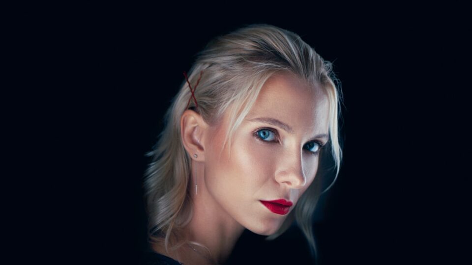
If you want a reliable, respectful, and repeatable approach to portrait retouching in Photoshop, this guide will walk you through it step by step. The focus here is portrait retouching in Photoshop done non-destructively, with realistic results that hold up in print and on high-resolution screens. You’ll learn how to clean up skin without plasticizing it, when frequency separation helps (and when it doesn’t), how to use dodge and burn to shape light instead of flattening detail, how to grade color while protecting skin tones, and how to prepare and deliver files professionally.
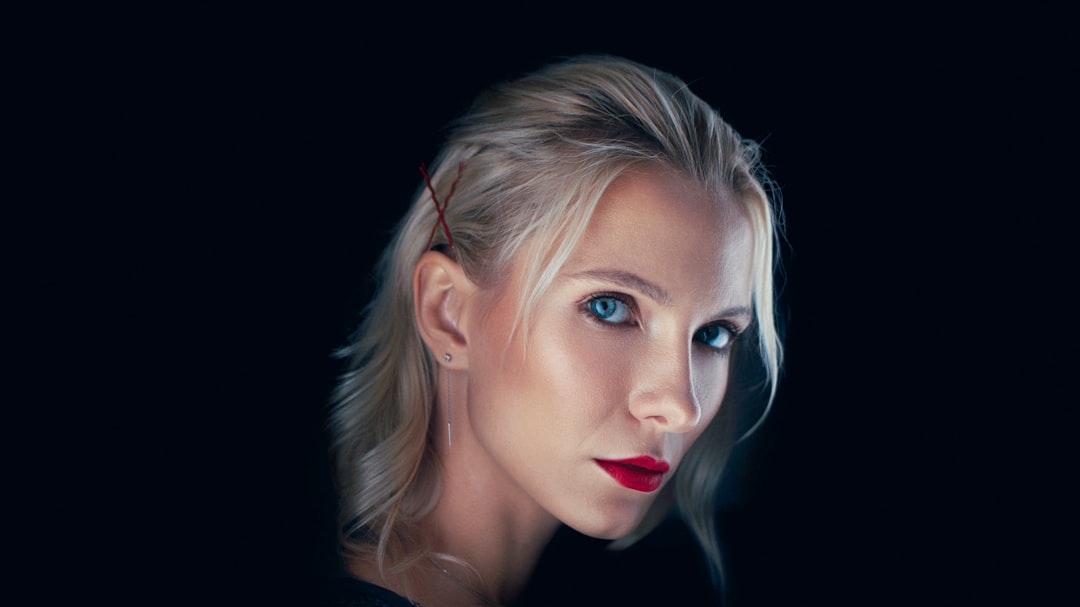
portrait retouching in Photoshop: step-by-step overview
Retouching can be a moving target depending on the subject, the light, and the intended output. The best way to gain consistency is to build a non-destructive workflow you can reuse, then adapt it to each project. Here’s the high-level map you’ll follow in this tutorial:
- Intake, intent, and ethics: what the subject wants, what the image needs, and where to draw the line.
- Non-destructive setup: smart objects, adjustment layers, masks, and a logical layer stack that you can revise any time.
- Skin cleanup: removing temporary distractions without erasing character.
- Frequency separation (optional): splitting tone from texture to fix complex issues.
- Dodge and burn: sculpting depth with tonal refinements on a neutral layer.
- Feature micro-enhancements: eyes, teeth, lips, and hair—subtle is the rule.
- Shaping light and background: gradients, masks, and vignettes used with restraint.
- Color grading: guiding mood while respecting natural skin tones.
- Sharpening and output: preparing files for web, social, and print.
- Maintenance and delivery: presets, actions, metadata, and archiving.
We will build each step with examples, checklists, and common pitfalls to avoid, so you can keep quality high even when deadlines press. If you want more tutorials and reference articles to complement this guide, browse the resources at EPhoto Life.
Set up a non-destructive workflow
Non-destructive editing means you can revise every decision without degrading the underlying pixels. That philosophy shapes the entire process. Start by opening your raw file in Adobe Camera Raw or Lightroom, make global exposure and white balance corrections there, and open the image into Photoshop as a smart object. That single move keeps your raw adjustments editable.
Build a logical layer stack so you know exactly where to look when you need to adjust something later:
- Base layer: a smart object with your raw adjustments.
- Cleanup group: healing and cloning layers for temporary distractions (stray hairs, lint, minor blemishes).
- Tone group: adjustment layers for global and local tone shaping (Curves, Levels, and midtone contrast).
- Color group: adjustment layers for color (Color Balance, Selective Color, Hue/Saturation).
- Detail group: dodge and burn layers, sharpening layers, and clarity micro-adjustments.
- Output group: final resizing, output-specific sharpening, soft-proofing, and export layers.
Use descriptive names for layers and groups. Mask everything instead of erasing. If you need to retouch on a pixel layer, create a blank layer set to Sample: Current & Below with the Healing Brush or Clone Stamp—this keeps your base smart object intact. For future reuse, record an action that builds your standard stack with folder names and the most common adjustments pre-created. Actions save minutes that add up to hours over a busy month.
Checklist: non-destructive setup
- Open from raw as a smart object.
- Create grouped layer structure for cleanup, tone, color, detail, and output.
- Prefer adjustment layers and masks; avoid direct painting on the base.
- Use Sample: Current & Below on blank pixel layers for healing/cloning.
- Save as a layered PSD or PSB with embedded color profile (usually Adobe RGB or sRGB depending on output).
Skin cleanup: stray hairs, blemishes, and distractions
Cleanup is where restraint matters most. The goal is to remove temporary distractions without rewriting someone’s face. On a blank layer above your base, select the Healing Brush (or Spot Healing for tiny issues) with Sample: Current & Below. Zoom in to 100–200% and sweep through the image methodically:
- Stray hairs crossing forehead or cheeks—fix if they draw attention away from the subject.
- Lint on clothing, sensor dust, or bright spots in the background—remove to focus the viewer.
- Temporary blemishes (minor acne, mosquito bites)—clean if the subject would not expect to see them in a portrait a month from now.
- Permanent features (moles, scars, freckles)—leave unless the client specifically asks to reduce visibility, and document the request.
Use a small brush relative to the blemish size and sample nearby clean skin with similar tone and grain. When cloning, match directionality: clone along the skin’s natural gradient rather than across it to avoid repeating patterns that look artificial. If you find hot spots (specular highlights) that feel too sharp, paint a subtle reduction on a low-opacity layer using a soft brush sampled from adjacent midtone skin, then blend with low opacity (5–15%) and feather the mask. Recheck at 50% zoom to confirm the fix remains invisible at normal viewing distance.
Two common mistakes: over-cleaning and softening texture globally. Over-cleaning creates a uniform surface that reads like plastic; viewers may not know why it feels off, but they notice. Global softening—often from blur filters—erases pores and micro-contrast. If you soften at all, do it locally, with a mask that preserves texture zones such as nose, cheeks, and forehead.
Frequency separation: when and how to use it safely
Frequency separation (FS) splits texture (high frequency) from tone and color (low frequency), enabling fixes that would be awkward on a single layer. It’s powerful but easy to abuse. Use it only when a specific problem calls for separating texture from tone—such as uneven makeup, patchy foundation, or color blotching—rather than as a blanket method.
Set up FS non-destructively:
- Duplicate your base into a “Low” layer; blur it just enough to remove pores while maintaining shapes (Gaussian Blur is fine). This holds tone/color.
- Create a “High” layer above by subtracting Low from the original to isolate texture. Common methods include Apply Image or High Pass; match settings to your document’s bit depth.
- Group Low and High inside a “FS” folder with a black mask so you can paint only where needed.
Workflow examples:
- Uneven foundation: paint on the Low layer with sampled skin color at very low flow (2–5%). Keep strokes small, follow facial contours, and avoid crossing strong edges.
- Texture repair: clone or heal on the High layer for tiny flakes or rough patches; keep brush size near the texture element you intend to fix.
FS pitfalls include removing too much texture and misaligning tone. If the Low layer’s blur radius is too high, transitions become mushy, and you’ll see halos along edges (nose, jawline, hairline). To avoid this, keep blur conservative and limit FS to small areas. For many portraits, selective healing and dodge and burn achieve cleaner, more believable results with less risk.
Dodging and burning for realistic depth
Dodge and burn (DnB) is tonal sculpting. You’re not “painting makeup” onto a face; you’re subtly reinforcing the light pattern that already exists. Create two 50% gray layers set to Soft Light (one for dodge, one for burn), or a single layer with two separate brushes. Use a low flow (1–5%) and a soft brush. Work zoomed out, then in, alternating frequently.
Start by reinforcing global structure:
- Burn the hairline and under the jaw slightly to frame the face.
- Dodge the forehead and cheek tops where the key light naturally falls.
- Burn the sides of the nose softly if needed to add separation from cheeks.
- Dodge the center of the lips lightly to add dimension; burn the corners a touch for shape.
Next, refine micro-contrast. Smooth tonal transitions around pores by dodging tiny, darker dips just enough to bring them closer to surrounding values, and burn overspecular points slightly to avoid hot spots. Always check before-after toggles with a temporary “exaggeration curve” (a Curves adjustment that increases contrast) to see whether your strokes drift toward stylization. If they do, roll them back.
DnB mistakes to avoid:
- High flow painting: it creates visible brush patterns and “airbrushed” surfaces.
- Ignoring the light: sculpting against the capture’s light direction makes contours look uncanny.
- Global DnB “smoothing”: this flattens natural shape; use micro-strokes along contours instead.
When handled gently, dodge and burn becomes the backbone of believable retouching, and it’s fully reversible.
Eyes, teeth, and lips: micro-enhancements without overdoing it
Feature enhancements should be subtle cues, not focal points that compete with the subject’s expression. Build a small “Features” group with masks for eyes, teeth, lips, and brows. Work at low opacity, then blend and back off. The goal is to nudge clarity and color to where the capture felt in person.
Eyes:
- Whites: add a masked Curves layer to lift midtones slightly, avoiding the extreme whites near tear ducts to prevent a chalky look.
- Iris: a selective Hue/Saturation layer with minor saturation (+5 to +10) and a tiny contrast boost can help; keep masks tight and feathered.
- Sharpness: a local, masked high-pass sharpening at small radius (0.7–1.2 px) adds sparkle without haloing. Blend mode Overlay or Soft Light.
Teeth:
- Color: target yellows with Hue/Saturation and reduce slightly; avoid reaching bluish territory.
- Value: lift very gently with Curves or Levels; over-brightening looks patchy and distracts.
Lips:
- Shape: minor dodge on center, minor burn on edges to define volume.
- Color: a soft, masked Hue/Saturation bump can reintroduce life lost to lighting; keep it minimal.
Brows and lashes: add clarity with careful burn strokes to reinforce structure. If the subject’s style calls for stronger brows, adjust with respect to the reference or makeup intent; document changes if requested by a client.
Shaping light: gradients, masks, and background control
Light shaping extends the retouch beyond the subject to the environment. Subtle background control ensures the face remains the natural focal point. Use gradient masks (on Curves or Levels) to build vignettes that guide attention, but watch for visible edges and color shifts.
Techniques:
- Radial vignette: add a Curves layer, pull down the shadows slightly, and mask with a large, feathered ellipse centered on the subject. Keep the effect mild.
- Directional gradient: simulate a soft flag by adding a masked gradient on one side of the frame to reduce stray brightness and increase dimensionality.
- Background color harmonization: a Selective Color or Hue/Saturation layer targeting the background hues can bring the palette into alignment with skin tones and wardrobe.
- Edge cleanup: use the Clone Stamp at low opacity to remove distractions along frame edges (exit signs, bright wall patches) on a blank layer.
If the capture suffers from mixed lighting (e.g., warm key, cool fill), consider isolating the subject with a careful subject mask (Select Subject refined manually) and independently correcting background color. Keep transitions feathered—harsh cutouts are obvious in portraits and can look unflattering.
Color grading that respects skin tones
Color grading is the mood dial. It also carries risk: skin tones are easy to push too far. Aim for “clean and believable” first, then move toward a creative palette in small steps. Use a combination of Selective Color, Color Balance, and curves in color mode to avoid unexpected luminance shifts.
Guidelines:
- Anchor neutrals: verify gray points (jacket buttons, white shirt areas out of glare) with an eyedropper readout. Keep them near neutral unless a stylized grade is requested.
- Skin hue window: most natural skin falls within a narrow hue range; adjust yellows and reds with Selective Color to refine without swinging toward magenta or green.
- Separate luminance from chroma: if you need warmer skin without darkening, consider a Curves layer set to Color blend mode to avoid compressing tonal range.
- Global harmony: if the background fights the wardrobe or skin, gently nudge it toward a complementary hue rather than overpowering the portrait.
To maintain quality across devices, soft-proof your grade by toggling between sRGB and Adobe RGB previews and previewing at different brightness levels. If this portrait is for print, calibrate your monitor and use a paper simulation profile to catch over-saturated shadows or blocked channels before delivery.
Sharpening and output for web, print, and social
Sharpening depends on target size and medium. What looks crisp at 2048 px wide on the web might be oversharpened once printed at 11×14 inches. Split “capture sharpening” (enhancing detail) from “output sharpening” (compensating for display or print process). Keep both reversible.
Capture sharpening:
- Use a masked High Pass layer with a small radius (0.7–1.2 px) on eyes, hair detail, and fabric texture; blend with Soft Light or Overlay.
- Consider a nuanced sharpening on the whole image via Smart Sharpen applied to a smart object and masked off areas where noise or smooth skin might halo.
Output sharpening:
- Web/social: resize to platform-specific dimensions, then apply a mild Unsharp Mask (e.g., Amount 50–75%, Radius 0.4–0.7, Threshold 2). Preview at 100%.
- Print: resize to final print size at 300 ppi, then apply a conservative Smart Sharpen tuned for the paper type. Matte papers tolerate slightly more sharpening than glossy due to dot gain.
- Cross-check: print a small proof or use simulated proofing profiles to test for halos, jaggies, and muddy shadows.
Embed the correct profile on export (sRGB for most web delivery, printer profile or Adobe RGB for certain print workflows). Include metadata (copyright, contact, client name) and a short delivery note indicating the intended use and any specific viewing recommendations.
Ethics, consent, and client communication
Retouching shapes how people are seen. A respectful approach keeps agency with the subject and aligns your edits with the purpose of the portrait. Start by discussing intent: is this for a corporate profile, personal branding, editorial, or family keepsake? Different contexts call for different degrees of polish.
Best practices:
- Consent: ask what the subject is comfortable adjusting. Offer to reduce temporary distractions and refine light, and be cautious about altering permanent features unless requested.
- Transparency: if a client requests heavier changes, document them and offer a preview layer that can be toggled so they understand what changed.
- Representation: avoid “perfecting” people into a single standard. Maintaining texture and character usually reads more confidently and is kinder.
- Expectations: set timelines and rounds of feedback up front; include what constitutes a revision versus a new edit.
Ethics also includes delivery honesty. If a social platform compresses heavily, tell the client you’ll provide a web-optimized version that preserves detail as much as possible. If the portrait will appear next to text, consider how contrast and color interact with the publication’s layout. Good communication builds trust and reduces rework.
Troubleshooting common retouching problems
Even a solid workflow hits snags. Here are typical issues and fixes you can apply quickly:
- Skin looks plastic after cleanup: reduce opacity of your cleanup layer, bring back texture with gentle dodge and burn on the micro level, and ensure no global blur crept in.
- Color banding in gradients: work at 16-bit where possible, avoid aggressive posterizing with Hue/Saturation, and use noise dithering when needed.
- Halos around edges after sharpening: lower radius, mask sharpening away from smooth transitions, or try a blend-if to limit sharpening to midtones.
- Over-vignette: feather wider, reduce layer opacity, and check for color shifts. A vignette should be invisible, not a ring.
- Mixed lighting creating green/magenta casts: isolate the subject with a refined mask and correct background separately; use Selective Color to target problem channels.
- Uneven makeup: try localized frequency separation with small-radius painting on the Low layer and texture fixes on the High layer; keep your mask confined.
- Eyes too bright: reduce Curves adjustment, add a soft mask feather, and check at full-screen to ensure the eyes support the expression rather than dominate.
Develop a habit of zoom-level cycling: 25%, 50%, 100%, and full-screen. A fix that looks right at 300% may be overdone at normal viewing distances. Also, toggle your layers with solo mode to see each adjustment’s contribution—if an adjustment doesn’t improve the image, delete or disable it.
Maintenance: presets, actions, and file organization
A streamlined practice reduces stress and errors. Build small, modular tools you can reuse in different portraits.
Presets and actions:
- Camera Raw/Lightroom presets: for base exposure, white balance, and lens corrections tailored to your camera and lenses.
- Photoshop actions: create an action that builds your layer stack (cleanup, tone, color, detail, output), plus micro-actions for DnB layer creation, FS setup, and common selective color moves.
- Color LUTs: save gentle LUTs for mood nudges; keep them low-opacity and masked by default.
File organization:
- Naming: use a consistent scheme that includes client or subject name, date, and version number. Example: “Lastname_Firstname_2026-09_portrait_v03.psd”.
- Folders: keep captures, working PSDs, exports, and client deliveries in separate folders to avoid confusion. Mirror the structure project to project.
- Backups: version frequently and keep a snapshot before major changes (create a history layer in PSD or duplicate the file). Archive with metadata and a final PDF proof if the project involves print.
Documentation: add a simple notes layer at the top with a text record of key decisions (“reduced background blue by 10, lifted lips midtone +5, masked sharpening from cheeks”). This saves guesswork if you revisit the file weeks later or need to explain the work to a collaborator.
Practical checklist: from import to delivery
Use this concise checklist to keep projects on track. Print it or save it as an action-triggered note.
- Intent and consent discussed; notes recorded.
- Raw opened as smart object; base corrections applied.
- Layer stack created; groups named.
- Cleanup pass: temporary distractions removed with healing on blank layer.
- Optional FS: only for localized tone/texture problems; mask tightly.
- DnB pass: global structure first, micro-contrast second; low flow strokes.
- Features group: eyes, teeth, lips—subtle tweaks; mask accurately.
- Background and light shaping: gradients and vignettes kept gentle.
- Color grade: neutrals anchored, skin protected; device soft-proofed.
- Sharpening: capture vs. output separated; profile embedded.
- Export: dimensions and compression tailored to destination; delivery note included.
- Archive: layered PSD/PSB saved, exports organized, metadata complete.
Case example: adapting the workflow to different portraits
No two portraits are identical. Here’s how the same workflow flexes for three scenarios.
Corporate headshot: often shot with soft light and neutral backgrounds. Cleanup tends to be minimal. Skip FS; use selective DnB to add shape around jawline and eyes. Keep color neutral and apply a tiny vignette for focus. Output sharpen for web (LinkedIn or company site) and deliver sRGB files with a small and a large size.
Editorial portrait: light and color may be more dramatic. Cleanup can include removing mid-background distractions. Use gradient masks to balance the frame. Apply a creative grade that supports the story, but keep skin within a believable range. Provide both print-ready Adobe RGB and web sRGB exports; include a note about the preferred look if post-layout adjustments are made.
Family portrait: emphasize warmth and authenticity. Focus cleanup on lint and stray hairs; leave character features intact. Keep DnB gentle and color warm, avoiding heavy stylization. Export an album-ready print size and a web gallery set; advise on paper choices if asked (matte vs. glossy) without promising specific outcomes.
Closing notes: build skill through repetition and restraint
Every retouch is a series of small decisions. The more often you follow a clear, non-destructive process, the easier it becomes to keep those decisions aligned with your intent and your subject’s comfort. Aim for consistency first; artistry grows on top of that foundation. Practice cleanup and DnB on short sessions, and review your own work a week later with fresh eyes—you’ll see where you can reduce and refine.
With this workflow you can handle most portrait challenges without resorting to heavy-handed techniques. When in doubt, back off, reset your masks, and ask whether the change supports the person in the photo. Respect, clarity, and craft will take you far—on screen and in print.